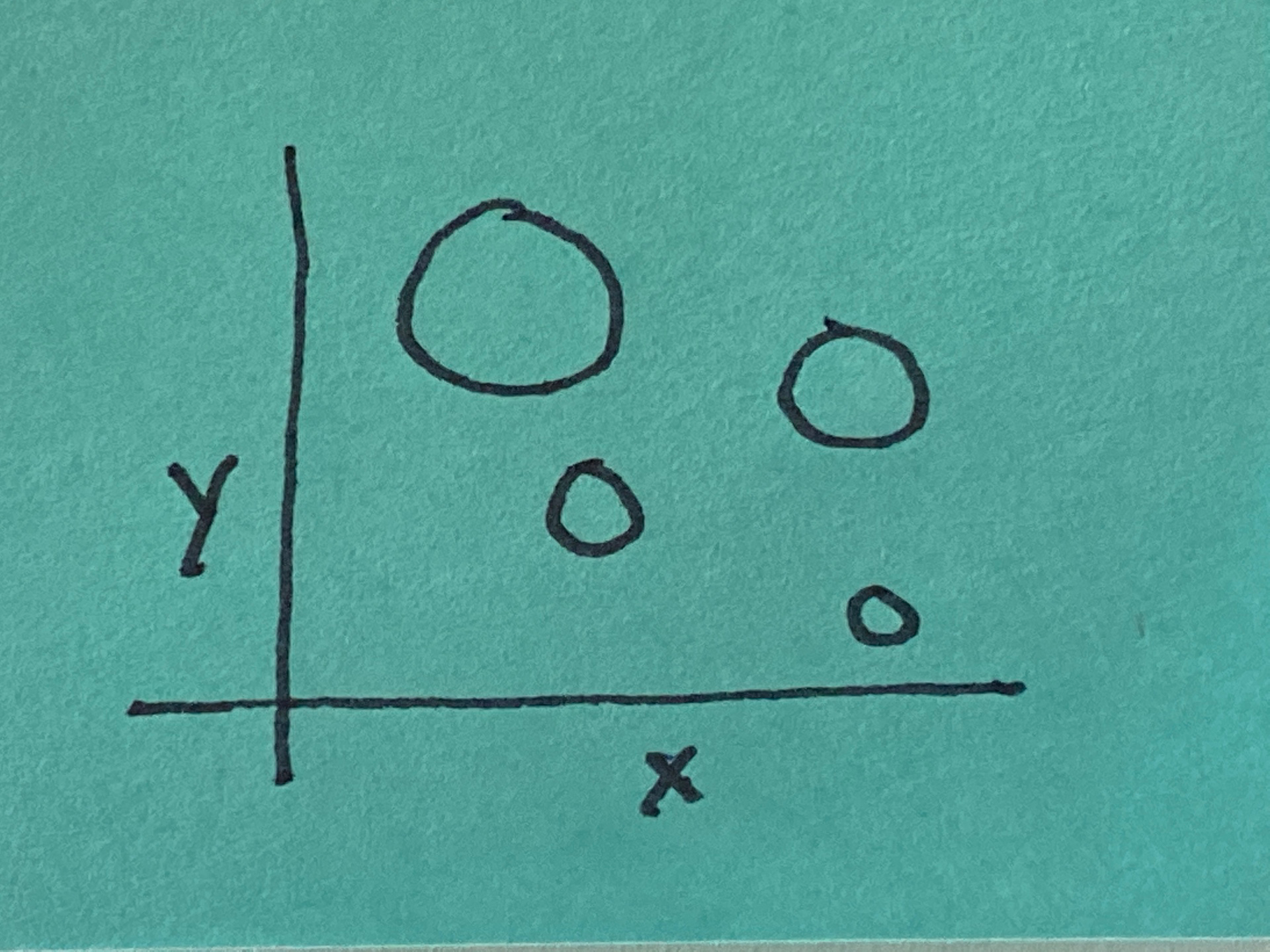
Multi-Variable Plot
Create a multi-variable plot to visually show ‘why’: how objects interact in a complex way.
as Comprehensive Sensemakers, we need to be able to take complex information and make sense of it. These kinds of visual tools can help.
In order to solve big problems, we need to be able to understand complexity better
-
This is one of the six visual frameworks identified by Dan Roam in his book The Back of the Napkin, each answering one of the key questions: who/what, how much, where, when, how, and why. This framework is a little different in that the objects’ relationship is defined by the interaction of two or more of the other key questions: who/what, how much, where, when, and how.
-
A multi-variable plot is useful as a general framework for history: events can be placed in time and space, i.e. at a location on Earth—Map—at a specific time—Timeline.
-
A commonly used two-variable plot is the time series chart that combines a Timeline on one axis and some quantity—Chart—on the other. You could also see this kind of chart as a variant of a timeline.
-
The good folks at GapMinder.org have assembled a number of these kinds of multi-variable plots showing some encouraging human progress. In many cases, the time dimension is built into an animation so you can see how other variables have changed over time.
Therefore:
Create a multi-variable plot to visually show ‘why’: how objects interact in a complex way.
These kinds of visualizations can give us a window into how some part of a system is structured and interacts—Flowchart