Chart
Create a chart to visually show ‘how much’: the relative quantities of multiple objects.
according to Numeracy, you want to get more comfortable with consuming and producing numerical information; using and creating charts is one way to make quantities more accessible and clear.
For some, a spreadsheet filled with numbers presents clear insights, but for many of us, a picture is worth a thousand numbers.
-
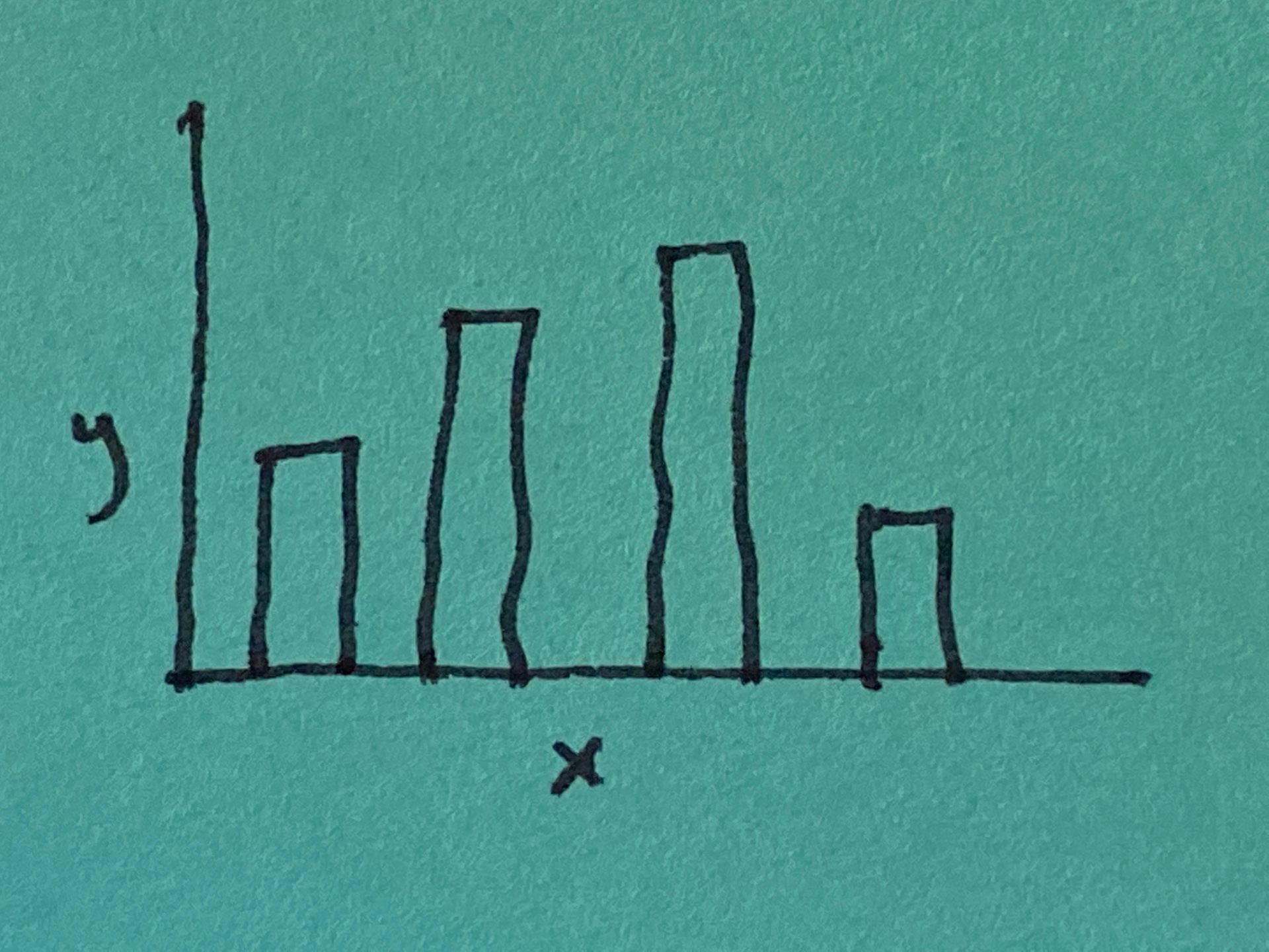
Charts are used to display or show quantities in a visual form. There are many kinds of charts including the bar chart (shown in image), line chart, pie chart, bubble chart, and almost endless variations on these.
-
The chart is one of the six visual frameworks identified by Dan Roam in his book The Back of the Napkin, each answering one of the key questions: who/what, how much, where, when, how, and why. It’s useful to think about a chart as a visual framework because it expands its possibilities. Instead of being a specific format we choose in a spreadsheet software, it becomes a generalized tool that we can use in creative ways.
-
There are other graphic forms that combine ‘how much’ data with other types of data that we have shown in different patterns
-
a data map shows how much of something across an area of the world (e.g. a map showing all the counties in the U.S., color coded to show how much money goes to schools per capita);
-
a time series shows how a quantity has changed over time (e.g. performance of the S&P 500 over the past year).
-
-
Charts and other graphical displays are often talked about as “presentation tools” for showing data, that you presumably already understand, to others. It doesn’t have to be limited to that. Creating charts of various kinds using data your are trying to understand can be an important source of insight. Remember that you can use charts to communicate with yourself as well as to others.
-
Graphic representations of data, like charts, are considered suspicious by many people. As Edward Tufte notes: “For many people, the first word that comes to mind when they think about statistical charts is ‘lie.’ No doubt, some graphics do distort the underlying data, making it hard for the viewer to learn the truth. But data graphics are no different from words in this regard, for any means of communication can be used to deceive.” (Tufte, The Visual Display of Quantitative Information, p.53) If you are creating these charts, you must strive for what Tufte calls “graphical integrity:” you must tell the truth about the data. If you strive for accuracy in your writing, do the same with your drawings.
-
You also want to reduce clutter in your graphics, what Tufte calls “chartjunk.” Or as Dan Roam says: “It’s the data that matters, so let it show.”
-
You have a number of different kinds of charts to choose from, so pick the simplest chart that will make your point.
Therefore:
Create a chart to visually show ‘how much’: the relative quantities of multiple objects; make sure that your chart tells the truth about your data.
“How much” data can be combined in useful ways with a Timeline or Map as well as a Multi-Variable Plot